library(tidyverse)
library(Hmisc)
library(corrplot)
library(lubridate)
library(leaflet)
library(sf)
library(viridis)
library(stringr)
library(tidyr)
library(tigris)
library(htmltools)5 From School To Juvenile Incarceration
5.1 From School To Juvenile Incarceration
This is a project that I hope to present at the NYC OpenData conference next spring. I must admit that there are some datasets that I intended to use for this final assignment, but because of time and roadblocks, I will focus on the three key datasets for now. My goal is to keep working on this project by finding a meaningful way to include the other datasets. I believe that this project has the potential to become something special. Understanding the relationship between probation supervision levels, juvenile rearrest rates, and school discharge may help policymakers evaluate whether current probation resources are sufficient to reduce recidivism among youth.
5.1.1 Loading Libraries
5.2 Preparing Rearrest Rate Data
I will use three datasets from NYC OpenData. Let’s load the “rearrest rate” and the the “DOP Juvenile” datasets. This dataset contains the number of juvenile probationers rearrested divided by the number supervised during the reporting period. This dataset contains the number of active juvenile probation supervision cases on the last day of the reporting period:General Supervision, Pathways to Excellence Achievement and Knowledge (PEAK), Every Child Has An Opportunity To Excel And Succeed (ECHOES), Juvenile Justice Initiative (JJI), Advocate Intervene Mentor (AIM), Enhanced Supervision Program (ESP). The “school discharge” dataset provides annual reporting on New York City Department of Education student discharges and transfers, as required by Local Law 42. It includes the number of students discharged or transferred by grade or cohort, disaggregated by demographics (race/ethnicity, gender, age, English language learner status, and special education status) and summarized at multiple geographic levels (citywide, borough, district, and school). Discharge and transfer codes indicate the reason students exited or moved within the system.
5.2.1 Loading Rearrest Data
# Load dataset
rea <- nycOpenData::nyc_dop_juvenile_rearrest_rate(limit = 10000)
# Preview first few rows
rea %>%
head() %>%
knitr::kable(
caption = "Preview of juvenile rearrest rate data from NYC Open Data, showing key variables related to rearrest trends over time."
)| borough | month | year | rate |
|---|---|---|---|
| Citywide | January | 2026 | 4.6 |
| Citywide | September | 2025 | 4.5 |
| Citywide | December | 2025 | 4.4 |
| Citywide | July | 2025 | 5.3 |
| Citywide | October | 2025 | 4.4 |
| Citywide | August | 2025 | 4.6 |
5.2.2 Cleaning Rearrest Data
rea_clean <- rea %>%
filter(year >= 2023 & year <= 2025)
rea_clean <- rea_clean %>%
mutate(
month_year = paste(month,year, sep = " "),
month_year = my(month_year)
)
rea_clean <- rea_clean %>%
select(-month, -year)5.3 Preparing Juvenile Cases Dataset
This dataset contains the number of active juvenile probation supervision cases on the last day of the reporting period: General Supervision, Pathways to Excellence Achievement and Knowledge (PEAK), Every Child Has An Opportunity To Excel And Succeed (ECHOES), venile Justice Initiative (JJI), Advocate Intervene Mentor (AIM), Enhanced Supervision Program (ESP).
# Load dataset
juv <- nycOpenData::nyc_dop_juvenile_cases(limit = 10000)
# Preview first few rows
juv %>%
head() %>%
knitr::kable(
caption = "Sample of the NYC Department of Probation juvenile cases dataset, illustrating the structure and key variables used in the analysis."
)| borough | supervision_caseload_type | month | year | supervision_caseload_count |
|---|---|---|---|---|
| Citywide | Enhanced Supervision Program | January | 2026 | 279 |
| Citywide | Juvenile Justice Initiative | January | 2026 | 135 |
| Citywide | IMPACT | January | 2026 | 0 |
| Citywide | Advocate Intervene Mentor | January | 2026 | 36 |
| Citywide | Every Child Has An Opportunity To Excel And Succeed | January | 2026 | 0 |
| Citywide | General Supervision | January | 2026 | 640 |
5.3.1 Cleaning Rearrest Data
juv_clean <- juv %>%
filter(year >= 2023 & year <= 2025)
juv_clean <- juv_clean %>%
mutate(
month_year = paste(month,year, sep = " "),
month_year = my(month_year)
)
juv_clean <- juv_clean %>%
select(-month, -year)
juv_clean <- juv_clean %>%
mutate(supervision_caseload_count = as.numeric(supervision_caseload_count))5.4 Combining Datasets
To investigate whether probation caseload size relates to rearrest rates, the datasets were aggregated by month and merged using the month_year variable. This allows direct comparison between monthly rearrest rates and the total number of youth supervised.
juv_month <- juv_clean %>%
group_by(month_year) %>%
summarise(
total_cases = sum(supervision_caseload_count, na.rm = TRUE)
)
combined_data <- rea_clean %>%
left_join(juv_month, by = "month_year")
combined_data$rate <- as.numeric(combined_data$rate)
combined_data %>%
head() %>%
knitr::kable(
caption = "Preview of the merged dataset combining juvenile rearrest rates with monthly juvenile probation caseloads. This table confirms successful alignment by month-year and prepares the data for subsequent analysis."
)| borough | rate | month_year | total_cases |
|---|---|---|---|
| Citywide | 4.5 | 2025-09-01 | 1114 |
| Citywide | 4.4 | 2025-12-01 | 1078 |
| Citywide | 5.3 | 2025-07-01 | 1092 |
| Citywide | 4.4 | 2025-10-01 | 1109 |
| Citywide | 4.6 | 2025-08-01 | 1106 |
| Citywide | 4.5 | 2025-11-01 | 1095 |
5.5 Analysis
5.5.1 Correlation Analysis
cor(combined_data$rate, combined_data$total_cases, use = "complete.obs")[1] 0.4935201The correlation coefficient suggests the degree to which larger supervision caseloads correspond with higher or lower rearrest rates. While correlation does not imply causation, the relationship provides preliminary insight into how supervision capacity may relate to youth outcomes.
5.5.2 Regression Analysis
A simple linear regression was used to test whether monthly probation caseload levels predict rearrest rates.
model <- lm(rate ~ total_cases, data = combined_data)
summary(model)
Call:
lm(formula = rate ~ total_cases, data = combined_data)
Residuals:
Min 1Q Median 3Q Max
-1.7650 -0.6115 0.2154 0.4185 1.1668
Coefficients:
Estimate Std. Error t value Pr(>|t|)
(Intercept) 2.303612 0.477335 4.826 3.29e-05 ***
total_cases 0.001675 0.000522 3.210 0.00302 **
---
Signif. codes: 0 '***' 0.001 '**' 0.01 '*' 0.05 '.' 0.1 ' ' 1
Residual standard error: 0.6221 on 32 degrees of freedom
(2 observations deleted due to missingness)
Multiple R-squared: 0.2436, Adjusted R-squared: 0.2199
F-statistic: 10.3 on 1 and 32 DF, p-value: 0.0030175.5.3 Time Series Comparison
combined_scaled <- combined_data %>%
mutate(rate_scaled = scale(rate),
cases_scaled = scale(total_cases))
ggplot(combined_scaled, aes(x = month_year)) +
geom_line(aes(y = rate_scaled, color = "Rearrest Rate"), size = 1) +
geom_line(aes(y = cases_scaled, color = "Caseload"), size = 1) +
labs(title = "Rearrest Rates and Juvenile Caseloads Over Time",
x = "Date", y = "Standardized Value", color = "Variable") +
theme_minimal()Warning: Using `size` aesthetic for lines was deprecated in ggplot2 3.4.0.
ℹ Please use `linewidth` instead.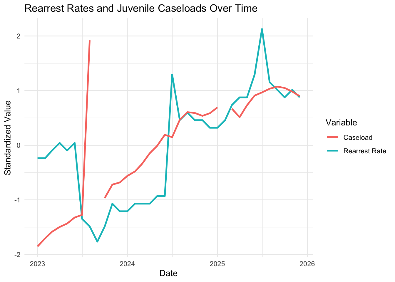
The standardized trend lines show that rearrest rates and caseloads generally move together, suggesting months with higher supervision counts tend to correspond with higher rearrest rates.
5.5.4 Visualizing Caseload and Rearrest Rates
ggplot(combined_data, aes(x = total_cases, y = rate)) +
geom_point(color = "darkblue", alpha = 0.7, size = 3) +
geom_smooth(method = "lm", se = FALSE, color = "red") +
labs(
title = "Relationship Between Juvenile Caseloads and Rearrest Rates",
x = "Total Juvenile Probation Caseload",
y = "Rearrest Rate"
) +
theme_minimal()`geom_smooth()` using formula = 'y ~ x'Warning: Removed 2 rows containing non-finite outside the scale range
(`stat_smooth()`).Warning: Removed 2 rows containing missing values or values outside the scale range
(`geom_point()`).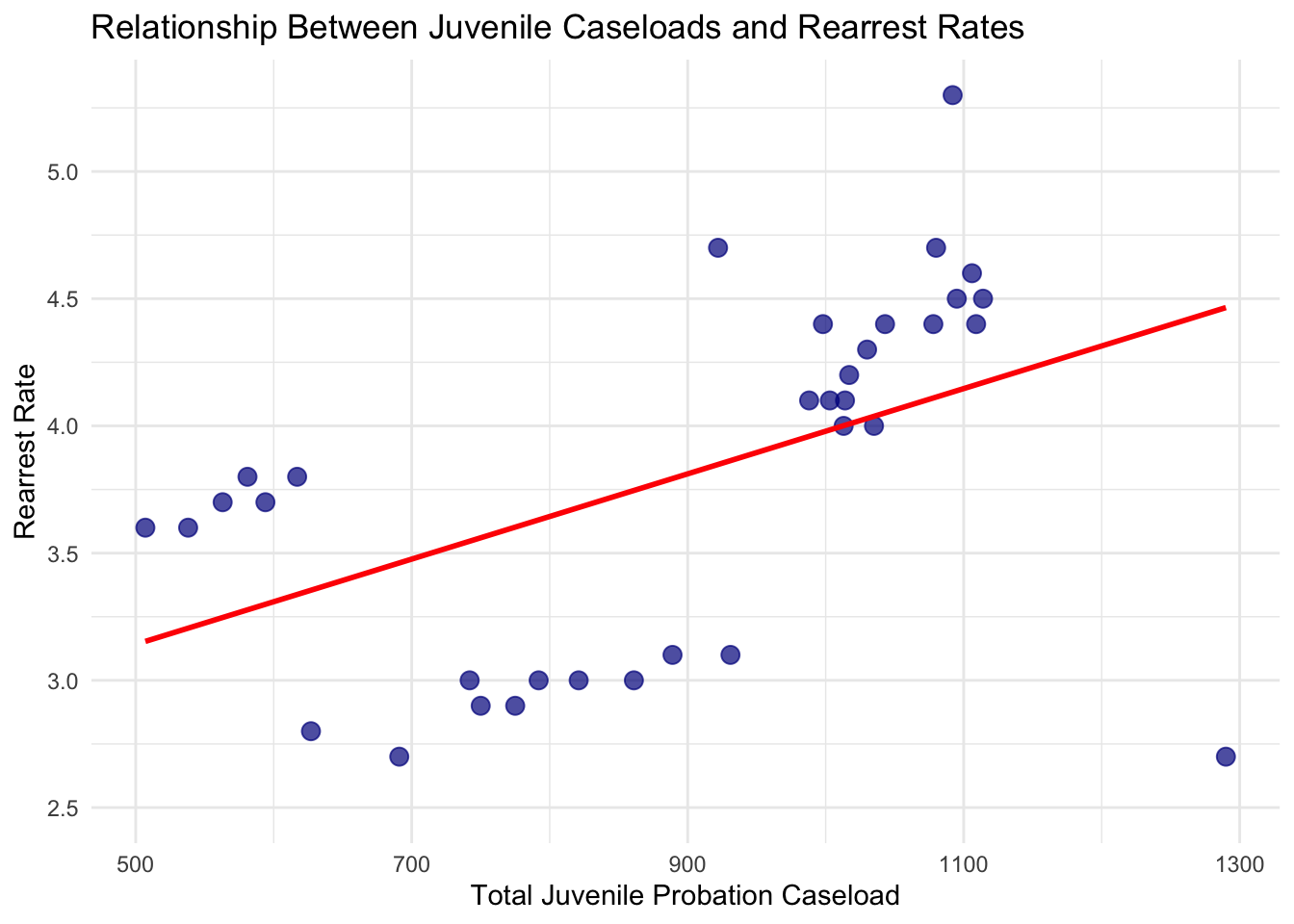
This scatterplot shows the relationship between total juvenile probation caseloads and rearrest rates each month. The red trend line suggests that months with higher caseloads tend to have slightly higher rearrest rates, though there is variation and other factors likely play a role. While this doesn’t prove causation, it highlights how supervision levels may be related to youth outcomes and can inform resource planning.
5.6 Investigating Middle School vs High School Discharge
# Load and clean dataset
sdis <- nycOpenData::nyc_school_discharge(limit = 10000) %>%
select(-code, -discharge_description)
# Preview cleaned dataset
sdis %>%
head() %>%
knitr::kable(
caption = "Preview of the NYC school discharge dataset after removing unnecessary variables. The data include discharge counts by school level, district, and discharge type."
)| year | report_category | school_level | geographic_unit | school_name | student_category | discharge_category | count_of_students | total_enrolled_students |
|---|---|---|---|---|---|---|---|---|
| 2022-2023 | School | Middle School | 32K562 | EVERGREEN MS FOR URBAN EXPLORATION | Male | Drop Out | s | 180 |
| 2022-2023 | School | Middle School | 75K036 | PS 36 | Female | Discharge out of NYC School | s | 22 |
| 2022-2023 | School | Middle School | 75K036 | PS 36 | Male | Discharge out of NYC School | s | 83 |
| 2022-2023 | School | Middle School | 75K140 | PS K140 | Female | Discharge out of NYC School | s | 23 |
| 2022-2023 | School | Middle School | 75K140 | PS K140 | Male | Discharge out of NYC School | s | 122 |
| 2022-2023 | School | Middle School | 75K141 | PS K141 | Male | Discharge out of NYC School | s | 61 |
5.6.1 Preparing Discharge Data
sdis_male <- sdis %>%
filter(
student_category == "Male",
school_level %in% c("Middle School", "High School"),
count_of_students != "s",
total_enrolled_students != "s"
) %>%
mutate(
count_of_students = as.numeric(count_of_students),
total_enrolled_students = as.numeric(total_enrolled_students)
)
sdis_male <- sdis_male %>%
mutate(discharge_rate = count_of_students / total_enrolled_students)5.6.2 Summarizing Discharge Data
sum_r <- sdis_male %>%
group_by(school_level) %>%
summarise(
mean_rate = mean(discharge_rate, na.rm = TRUE),
sd_rate = sd(discharge_rate, na.rm = TRUE),
n_schools = n()
)
sum_r %>%
knitr::kable(
caption = "Summary statistics of discharge rates for male students by school level, including the mean discharge rate, standard deviation, and number of schools."
)| school_level | mean_rate | sd_rate | n_schools |
|---|---|---|---|
| High School | 0.0697668 | 0.0778978 | 100 |
| Middle School | 0.0573623 | 0.0607013 | 66 |
5.6.3 Discharge Analyzes
5.6.3.1 Independent T-Test
t.test(discharge_rate ~ school_level, data = sdis_male)
Welch Two Sample t-test
data: discharge_rate by school_level
t = 1.1492, df = 159.43, p-value = 0.2522
alternative hypothesis: true difference in means between group High School and group Middle School is not equal to 0
95 percent confidence interval:
-0.008913023 0.033721970
sample estimates:
mean in group High School mean in group Middle School
0.06976680 0.05736233 T-Test results show no significant difference between males in middle school vs high school discharge.
5.6.3.2 Discharge Types by School Level
table_male <- sdis_male %>%
group_by(school_level, discharge_category) %>%
summarise(total = sum(count_of_students), .groups = "drop")
c_tab <- xtabs(total ~ school_level + discharge_category, data = table_male)
knitr::kable(
c_tab,
caption = "Contingency table showing total counts of discharge types by school level for male students."
)| Discharge out of NYC School | Drop Out | |
|---|---|---|
| High School | 957 | 930 |
| Middle School | 1363 | 0 |
5.6.3.3 Chi-Square Analysis
chi_res <- chisq.test(c_tab)
chi_table <- tibble::tibble(
Statistic = chi_res$statistic,
Degrees_of_Freedom = chi_res$parameter,
P_Value = chi_res$p.value
)
chi_table %>%
knitr::kable(
caption = "Chi-square test of independence examining the relationship between school level and discharge category for male students."
)| Statistic | Degrees_of_Freedom | P_Value |
|---|---|---|
| 938.6163 | 1 | 0 |
5.6.4 Visualizing Discharge Patterns
5.6.4.1 Discharge Rates by School Level
ggplot(sdis_male, aes(x = school_level, y = discharge_rate)) +
geom_boxplot() +
labs(
title = "Male Student Discharge Rates by School Level",
x = "School Level",
y = "Discharge Rate"
) +
theme_minimal()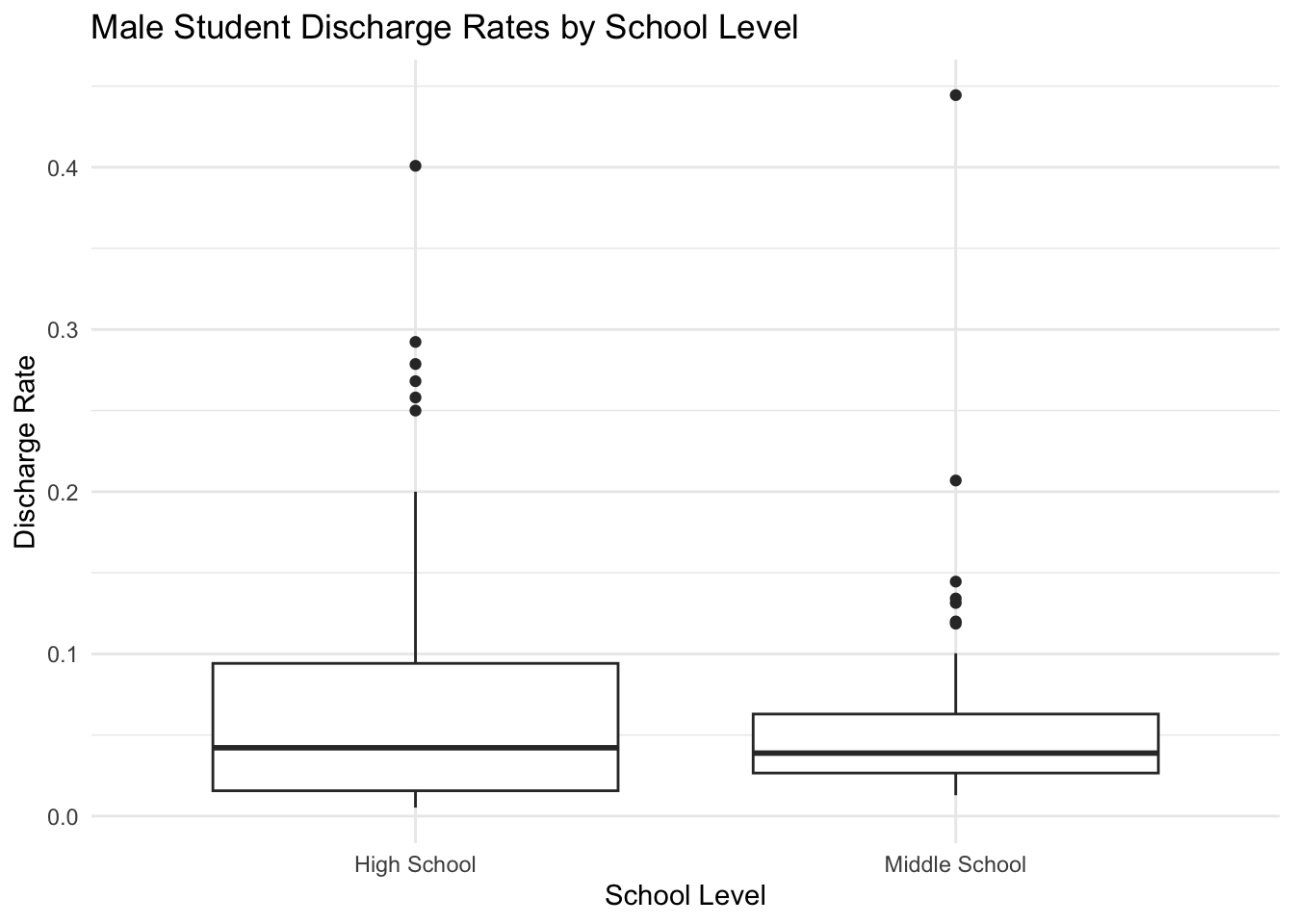
5.6.4.2 Discharge Type Composition by School Level
ggplot(table_male, aes(x = school_level, y = total, fill = discharge_category)) +
geom_bar(stat = "identity", position = "fill") +
labs(
title = "Distribution of Discharge Types Among Male Students",
y = "Proportion",
x = "School Level"
) +
theme_minimal()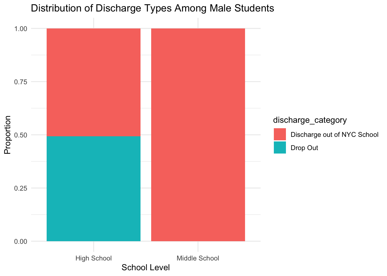
5.7 Mapping District-Level Differences
5.7.1 Preparing District-Level Data
sdis_male <- sdis %>%
filter(
student_category == "Male",
school_level %in% c("Middle School", "High School"),
count_of_students != "s",
total_enrolled_students != "s"
) %>%
mutate(
count_of_students = as.numeric(count_of_students),
total_enrolled_students = as.numeric(total_enrolled_students),
discharge_rate = count_of_students / total_enrolled_students,
district = str_extract(geographic_unit, "\\d+"),
district = sprintf("%02d", as.numeric(district))
) %>%
filter(!is.na(district))district_summary <- sdis_male %>%
group_by(district, school_level) %>%
summarise(
mean_rate = mean(discharge_rate, na.rm = TRUE),
.groups = "drop"
) %>%
pivot_wider(
names_from = school_level,
values_from = mean_rate
) %>%
mutate(rate_diff = `High School` - `Middle School`)5.7.2 Districts with the Largest Gaps
district_summary %>%
arrange(desc(rate_diff)) %>%
slice_head(n = 5) %>%
knitr::kable(
caption = "Top five districts with the largest positive difference between high school and middle school male discharge rates."
)| district | High School | Middle School | rate_diff |
|---|---|---|---|
| 02 | 0.1417620 | 0.0776684 | 0.0640936 |
| 03 | 0.1694915 | 0.1200000 | 0.0494915 |
| 08 | 0.0825433 | 0.0394737 | 0.0430696 |
| 21 | 0.0538933 | 0.0297701 | 0.0241231 |
| 10 | 0.0634714 | 0.0425624 | 0.0209091 |
5.7.3 Building the Spatial Dataset
nyc_districts <- school_districts(
state = "NY",
year = 2022,
class = "sf",
progress_bar = FALSE
) %>%
mutate(
district = substr(GEOID, nchar(GEOID) - 1, nchar(GEOID))
) %>%
filter(district %in% sprintf("%02d", 1:32))
map_data <- nyc_districts %>%
left_join(district_summary, by = "district")5.7.4 Static District Map
ggplot(map_data) +
geom_sf(aes(fill = rate_diff), color = "lightblue", linewidth = 0.2) +
scale_fill_viridis_c(
name = "High − Middle\nDischarge Rate",
na.value = "grey90"
) +
labs(
title = "Difference in Male Discharge Rates by School Level",
subtitle = "NYC School Districts",
caption = "Positive values indicate higher rates in high school"
) +
theme_minimal()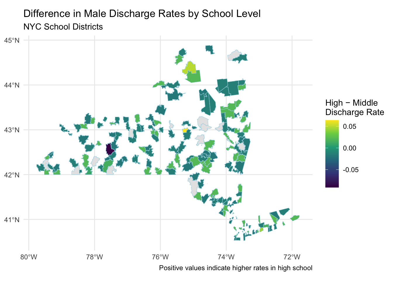
5.7.5 Interactive District Map
# Join district summary data to district boundaries
district_map <- nyc_districts %>%
left_join(district_summary, by = "district") %>%
sf::st_transform(4326)
# Create color palette
pal <- colorNumeric(
palette = viridis::viridis(256),
domain = district_map$rate_diff,
na.color = "grey90"
)
# Interactive leaflet map
leaflet(map_data) %>%
addProviderTiles("CartoDB.Positron") %>%
addPolygons(
fillColor = ~pal(rate_diff),
fillOpacity = 0.8,
color = "white",
weight = 1,
label = ~paste(
"District:", district,
"<br>High − Middle Rate:",
round(rate_diff, 3)
) %>% lapply(HTML)
) %>%
addLegend(
pal = pal,
values = ~rate_diff,
title = "High − Middle<br>Discharge Rate",
opacity = 1
)5.7.6 Focusing On Five Boroughs
leaflet(map_data) %>%
addProviderTiles("CartoDB.Positron") %>%
fitBounds(
lng1 = -74.30, lat1 = 40.45, # southwest corner
lng2 = -73.65, lat2 = 40.95 # northeast corner
) %>%
addPolygons(
fillColor = ~pal(rate_diff),
fillOpacity = 0.8,
color = "white",
weight = 1,
label = ~paste(
"District:", district,
"<br>High − Middle Rate:",
round(rate_diff, 3)
) %>% lapply(htmltools::HTML)
) %>%
addLegend(
pal = pal,
values = ~rate_diff,
title = "High − Middle<br>Discharge Rate",
opacity = 1
)5.8 Notes
Overall, combining probation and school discharge data helps us develop a better understand of systemic pressures on youth. Trends in caseloads, rearrests, and school discharges together highlight potential intervention points. Future work could include demographic data or other datasets to explore more intersectional patterns to gain deeper insights on the key players that lead to recidivism in youths.